In the intricate world of K-Pop, lightsticks serve as emblematic extensions, symbolizing the profound connection between an idol group and its dedicated fanbase.
TXT has consistently stood out with their eye-catching lightstick designs, characterized by vibrant hues, bold aesthetics, and endearing features.
Teasing the Unveiling
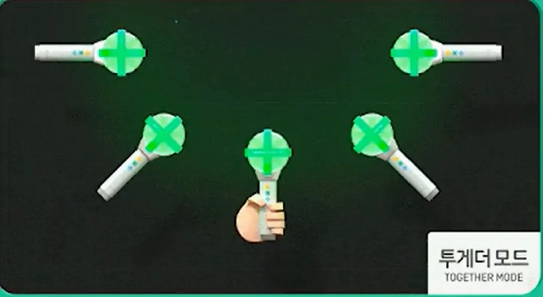
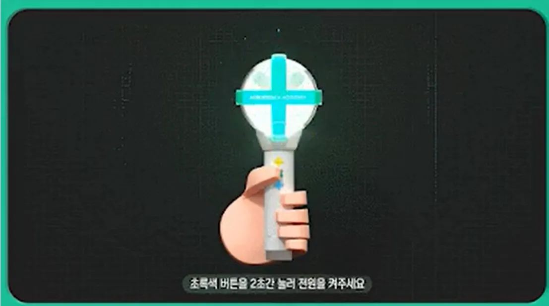
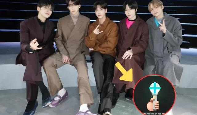
Following a series of tantalizing teasers, TXT finally unveiled the much-anticipated second version of their lightstick.
TOMORROW X TOGETHER OFFICIAL LIGHT STICK VER.2 TEASER(https://t.co/apUpMEy3VV)#투모로우바이투게더 #TOMORROW_X_TOGETHER #TXT
— TXT OFFICIAL (@TXT_bighit) January 29, 2024


she got more round and boba pic.twitter.com/DkskhNUzeT
— tina (@B3OMLUVS) January 29, 2024
Analyzing the Changes
Amidst the vibrant visual showcase, the ultimate design emerged, appearing strikingly akin to its predecessor, yet discerning eyes caught subtle alterations in the details.
IT CAN OPEN NOW TOO WE CAN PUT STUFF IN IT https://t.co/q1CAtLH3Sn pic.twitter.com/aWNRsOTxs8
— alice 🐧🌟 (@huegatito) January 29, 2024
I heard you can open the moabong and place items inside, so here is moabong ver. 2 in default mode.. and in blue spring mode! (with blue flowers) 💙 pic.twitter.com/E6GRPP5hhY
— ᥫ᭡ lishie 🪷🌟. 𖥔 ݁ ˖ (@L0VELYBEOMIE) January 29, 2024
As fan comments flooded in with positivity, observers noted a consensus that the MOA bong had undergone a “maturation”process.
they made her lose all of her colorful colors, ah yes puberty and depression 😭 pic.twitter.com/NyyOC9x8vZ
— dae 대 🎸 (@eloquestlydae) January 29, 2024
i’m kinda relieved they kept her original design, the moabong color and shape is still there. like she’s still your sister just a more matured one but i hv a feeling they removed the retractable feature (this i cant confirm until they release the actual lightstick) pic.twitter.com/syCksX7JY8
— 🐈⬛ (@inhalingtxt) January 29, 2024
the evolution is basically like this pic.twitter.com/zLS55WAuPV
— krysten (@TXTUNOFFlClAL) January 29, 2024
puberty hits pic.twitter.com/f6mUuQe1pU
— yunikoo (@bamkkyuuu) January 29, 2024
Netizens’ Mixed Reactions
Netizens, however, presented a mixed spectrum of reactions to the lightstick’s perceived maturation.
aaah good job hyb3 for not making the moabong black 😭 the little differences makes it look sleek and clean! and since it’s now a bubble shape i am hoping we can open it up and put things inside! im still hoping this is retractable and we keep the iconic finding moa feature 😭🙌 pic.twitter.com/pFMIIRmqgq
— Nikki (@pandesoobs) January 29, 2024
MOAs after finding out that the moabong version 2 didn’t undergo hybe-ification design: pic.twitter.com/Tlkyh0tzuW
— 팁 | Frozen Tuna 🐟🌟 (@normanvanillaH) January 29, 2024
we survived the apocalypse ☝🏼😭 https://t.co/g4HbbSzN9a pic.twitter.com/3BMuU0OohQ
— den (@velvetsoob) January 29, 2024
MOABONG DID NOT GO EMO WE CHEER pic.twitter.com/rClqfG4fNA
— krysten (@TXTUNOFFlClAL) January 29, 2024
Some felt a sense of relief that the lightstick retained its colorful essence, diverging from the trend seen in other HYBE-affiliated groups that embrace darker tones in their lightstick designs, as exemplified by SEVENTEEN’s latest version.
YOU MIGHT BE ALSO INTERESTED IN: TXT Fans Outraged Over Alleged Sexual Harassment Towards Group Maknae


