Overview of the New Avengers: Doomsday Logo
- The updated logo for Avengers: Doomsday debuted on Wednesday.
- Fan reactions have largely been negative, with many labeling it a downgrade from the original design.
- Supporters of the original logo appreciated its rugged, chaotic look, which conveyed a more serious tone.
In light of Marvel Studios’ recent announcements, Avengers: Doomsday has received a logo makeover. This change was highlighted in a new reveal, but not everyone is pleased.
The film was officially introduced during the San Diego Comic-Con (SDCC) in July 2024. Initially, it was set to be titled Avengers: The Kang Dynasty. However, due to issues surrounding its lead actor, Jonathan Majors, Marvel Studios shifted direction, leading to the emergence of Doomsday. Notably, Robert Downey Jr. returns to reprise his iconic role as Tony Stark, also known as Iron Man, who previously perished in Avengers: Endgame (2019) as a sacrificial hero. This recent unveiling included a new logo that has been met with criticism from fans.
Comparing the Original and Redesigned Logos
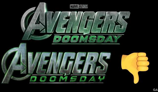
The original Avengers: Doomsday logo featured the word “Avengers”in bold metallic type with a weathered texture, showing distinct scratches that added a sense of age and battle-weariness. Below, the name “Doomsday”appeared in a sharp green font, accentuating the film’s darker theme. The traditional Marvel Studios logo was positioned atop, utilizing a stark black and white palette combined with muted greens to create an ominous atmosphere.
In contrast, the redesigned logo opts for a more polished and colorful aesthetic, introducing a greenish glow around each letter, perhaps alluding to Doctor Doom’s character. The rugged details from the previous design are lost, and the new “Doomsday”font is characterized by a luminous effect and wider spacing. The Marvel Studios logo has also transitioned to its colored version, showcasing vivid white and red hues.
New logo for ‘AVENGERS: DOOMSDAY.’ pic.twitter.com/lUuZ25a5iQ — MCU Film News (@MCUFilmNews) March 26, 2025
Fan Reactions
The introduction of the new logo has sparked significant conversation online, primarily leaning towards disappointment. Many fans expressed nostalgic sentiments towards the original, stating that the upgrade felt like a considerable dip in quality. Some commenters humorously likened the new design to amateur work created in graphic design software like Canva, while others suggested it resembles a promotional image for a video game rather than a blockbuster film.
Put the other one back — 🇨🇦↭ ð\u009d—¦ð\u009d—›ð\u009d—˜ð\u009d— ð\u009d—”ð\u009d—¥ ð\u009d—ªð\u009d—›ð\u009d—¢ð\u009d—¢ð\u009d—¥ð\u009d—˜ ↭🇨🇦 (@MalikHaelstrom) March 26, 2025
Old better — Bloodline4everâ˜\u009dðŸ\u008f¼ (@ShadyMo34239931) March 26, 2025
What a downgrade….. — lightning rad (@lightning_rad_) March 26, 2025
Old one is sooo much better, new one honestly looks fan made lmao — brain_tingle (@brain_tingle) March 26, 2025
I like the old one better, looked more serious — Joseph (@gamer41848) March 26, 2025
A Deeper Look at the Logos
At first glance, the old and new logos might appear comparable, but closer inspection reveals that the original carries a sense of wear and destruction, reflected in its visible scratches and muted colors. While the first design’s simplicity appeals emotionally, the new version opts for a clean and vibrant look. The updated logo embodies a more polished feel, yet many fans believe it lacks the storytelling depth that the original conveyed. Ultimately, perceptions of the design are subjective; while many resonate with the nostalgia of the previous version, some may prefer the new approach.
Avengers: Doomsday is set to premiere in theaters on May 1, 2026.
Source: MCU Film News/X


