
Minecraft has recently introduced a plethora of updates, many of which have been well-received by the community. The developers kicked off the year with a significant content drop featuring new mob variants, the addition of the firefly bush, enhanced ambiance effects, and minor tweaks to gameplay mechanics. However, not all changes have been met with enthusiasm, especially the modifications made to the user interface (UI) in the Bedrock Edition.
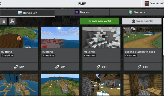
A recent post by Reddit user Ntn_X showcased the redesigned UI for the Worlds tab in Bedrock. Instead of the straightforward list view, worlds are now displayed in a grid format, which contains a lot of grey, empty spaces. Furthermore, the size of the world thumbnails has been enlarged, leading many players to feel that the design appears incomplete.
What do you think about this new UI update on Minecraft Bedrock? by u/Ntn_X in Minecraft
In response to the changes, user donqon expressed dissatisfaction, commenting that the current UI design is reminiscent of the early Xbox 360 era and has not improved since then. They noted the lack of visibility regarding the size and last access date of worlds without having to click on them, rendering the UI cumbersome.
User AmySorawo also criticized the excessive empty space in the grid layout, suggesting that a more compact design could enhance usability without sacrificing visual cleanliness.
Another user, DaSharkCraft, elaborated on the potential for improvement. They appreciated the introduction of tabs for worlds, servers, and Realms but criticized the tile-based organization as cluttery and cumbersome, especially for PC and console users who may prefer a simpler list format.
Contrarily, GoldenApple265 mentioned that players have the option to switch the UI back to a list view, indicating that Mojang may address players’ feedback regarding the user interface in future updates.
")
Others, like CaramelCraftYT, voiced a strong preference for the old interface, while Powerpuff_Bean lamented the current UI, noting challenges in viewing or modifying worlds within Realms. Even so, VaultDwellerGamer argued that while the new UI could be beneficial for Realms, it does poorly in managing individual worlds. Meanwhile, user Mushroom_Is_Red pointed out that the update obscured the export button, complicating world uploads to PC.
Exciting Future Updates on the Horizon
")
Mojang Studios is aligning a series of impressive updates for Minecraft later this year. During the Minecraft Live event, the developers unveiled exciting features including new ghast variants, the innovative locator bar, and the much-anticipated Vibrant Visuals graphics overhaul—updates that have collectively piqued community interest.
The introduction of ghast variants will add not only diversity to mobs but also new mechanics, allowing players to navigate the world without relying solely on the late-game elytra. The Vibrant Visuals update promises to elevate the game’s graphics, marking a significant leap toward modernizing the Minecraft experience.