
Nintendo Switch 2: High Expectations Met with Disappointment Over Home Screen UI
The gaming world is abuzz with anticipation for the Nintendo Switch 2, as fans eagerly await its launch following an extended period filled with speculation and leaks. The console is expected to showcase state-of-the-art technology along with innovative features. However, early impressions have revealed that while the Nintendo Switch 2 boasts impressive hardware upgrades, its home screen user interface (UI) has left many gamers feeling let down.
Enhanced Features, But a Lackluster UI
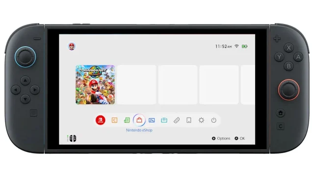
This much-anticipated console promises notable enhancements such as a more powerful processor, a larger screen, and a redesigned user interface aimed at improving user-friendliness. Recently, during a demonstration of its accessibility controls, glimpses of the home screen UI were unveiled. Many critics voiced their disappointment, arguing that the new design lacks the charm and distinct personality characteristic of previous Nintendo systems.
Twitter user @ActualAero expressed frustration with the UI, stating that it appears excessively simplistic and resembles the design of the original Nintendo Switch. They lamented:
“Was really hoping they were gonna add more charm and personality to it this time.”
Looking Back: The Charm of Older Nintendo UIs
Many long-time Nintendo enthusiasts remember the user interfaces of older systems such as the 3DS, which featured customizable themes and engaging background music. According to some critics, the current UI design appears “corporate” and lacks the playful creativity seen in past consoles like the Wii U. Reddit user u/Zmeya_210 shared similar sentiments, expressing nostalgia for the more imaginative designs of previous generations.
Comment by u/RobotCED from discussion in Switch
Diverse User Reactions to Home Screen Simplicity
The responses from the community have varied. While some users express disappointment at the lack of customization options, others indicate that their primary concern lies with the functionality of the eShop. Redditor u/raymate highlighted the desire for a faster and more efficient eShop experience, suggesting that improved UI performance takes precedence over aesthetic changes.
Comment by u/RobotCED from discussion in Switch
Additionally, user @Camsterocks reflected on how iconic soundtracks from consoles like the Wii brought extra charm to the gaming experience, pointing out the stark contrast in today’s UI design:
“The best part of the Wii was the f***ing music and they just can’t f***ing realize that. If I wanted this sh**ty ui I would just get a f***ing PlayStation 5.”
A Call for Customization and Personalization
Many fans have suggested potential tweaks to the UI that could enhance user experience, such as the ability to pin favorite games or use distinctive icons for better personalization. While customization may not be the most critical feature, the ability to make the console feel unique adds significant value to the gaming experience.
Nintendo’s Missed Opportunity for Innovation?
Critics argue that by sticking to the existing design philosophy, Nintendo might be overlooking a chance for creative innovation. While minor tweaks—like rounded corners and improved eShop functionality—have been welcomed, the broader concerns about visual design and user personalization seem to remain unaddressed.
Despite these criticisms, the clock isn’t entirely against Nintendo yet. There remains hope that the company will consider fan feedback and possibly roll out improvements or added customization features in future updates. As gamers await the launch, they continue to hope for a more engaging and personalized home screen experience.